
Latest
Large apartment complex appears likely for Canton outskirts
The Town of Canton’s governing board will soon consider approval of a substantial…
No one can accuse Canton town officials of not crossing their t’s and dotting their i’s.
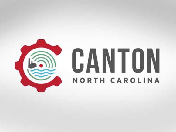
Vigorous debate over a much-needed logo presented to the town board last month as part of a comprehensive rebranding highlighted differences among the more progressive and traditional members of Canton’s town board.
The logo — designed by Maggie Valley-based design agency Creative Campfire — features symbolic imagery depicting Canton’s looming paper mill encircled by green arcs depicting mountains and blue waves representing the Pigeon River, all encircled in a large “C” fashioned to resemble the proverbial “gears of industry.”
At the center of the logo — and the spirited discussion at the town board meeting Dec. 8 — is a small dot, meant to represent the oneness or wholeness of the community itself, as well as the axle to which the gear would be attached.
“There are old folks like me who don’t get the symbolism,” said Alderman Carole Edwards.
Alderman Dr. Ralph Hamlett, however, said that people his age are indeed traditional but he likes the fact that the logo is targeted at “the type of individual we seek to attract.”


Canton lies perfectly positioned to capitalize on the plight of Ashevillians priced out of the housing market in that city. New businesses like Western Carolina Freightliner and BearWaters Brewing are bringing jobs and a sophisticated downtown culture to a town that desperately needs both of those things to catch the eye of prospective residents and businesses.
Canton’s new logo is meant to give those looking to relocate a sense of what the town offers in terms of nature and industry, and is the first serious makeover attempted in town since probably the 1970s, Town Manager Seth Hendler-Voss said.
But that dot — unassuming and almost overlooked amidst the more prominent features of the logo — seemed to cast a shadow across what the board felt was, overall, a solid effort.
There was talk of removing it, but Hendler-Voss, who comes from a design background himself, said that altering the logo would affect the integrity of the design as a whole, and suggested that the board either approve it as-is, or send Creative Campfire back to the drawing board.
When Alderman Zeb Smathers suggested looking at the logo without the dot, Hendler-Voss said that doing so would cause the town to incur costs over the $5,000 already budgeted for the logo. In the end, the board decided that it simply wasn’t worth the potential cost.
“I’m traditional,” Alderman Gail Mull said, “but I showed it to my grandkids [aged 10 and 14] and they loved it.”